Ozone is a mobile app that helps people adopt more sustainable habits in their daily lives.
YEAR
2024
ROLE
Product Design
UX/UI
Visual Identity
Challenge
During research into the online grocery shopping experience, we uncovered a recurring issue: users expressed frustration over the excessive amount of plastic and unnecessary packaging included in their deliveries. This highlighted a clear disconnect between the convenience of digital shopping and the growing desire for more sustainable consumption.
The opportunity was clear: how might we improve the online shopping experience by integrating more responsible practices that align with users’ environmental expectations?
Approach
Step 1: Understanding the user and their pain points
I conducted interviews and surveys with frequent online grocery shoppers. The insights revealed two main frustrations:
Lack of transparency regarding the types of packaging used.
No real options to choose more sustainable alternatives during the purchase process.
Step 2: Embedding sustainability into the user journey
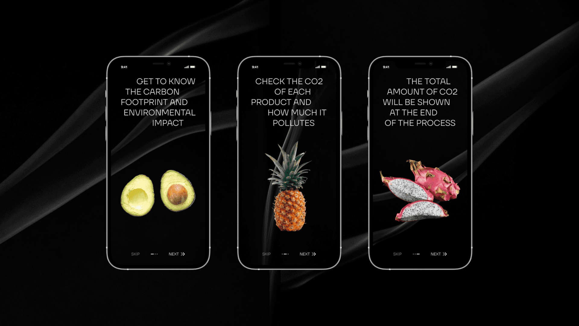
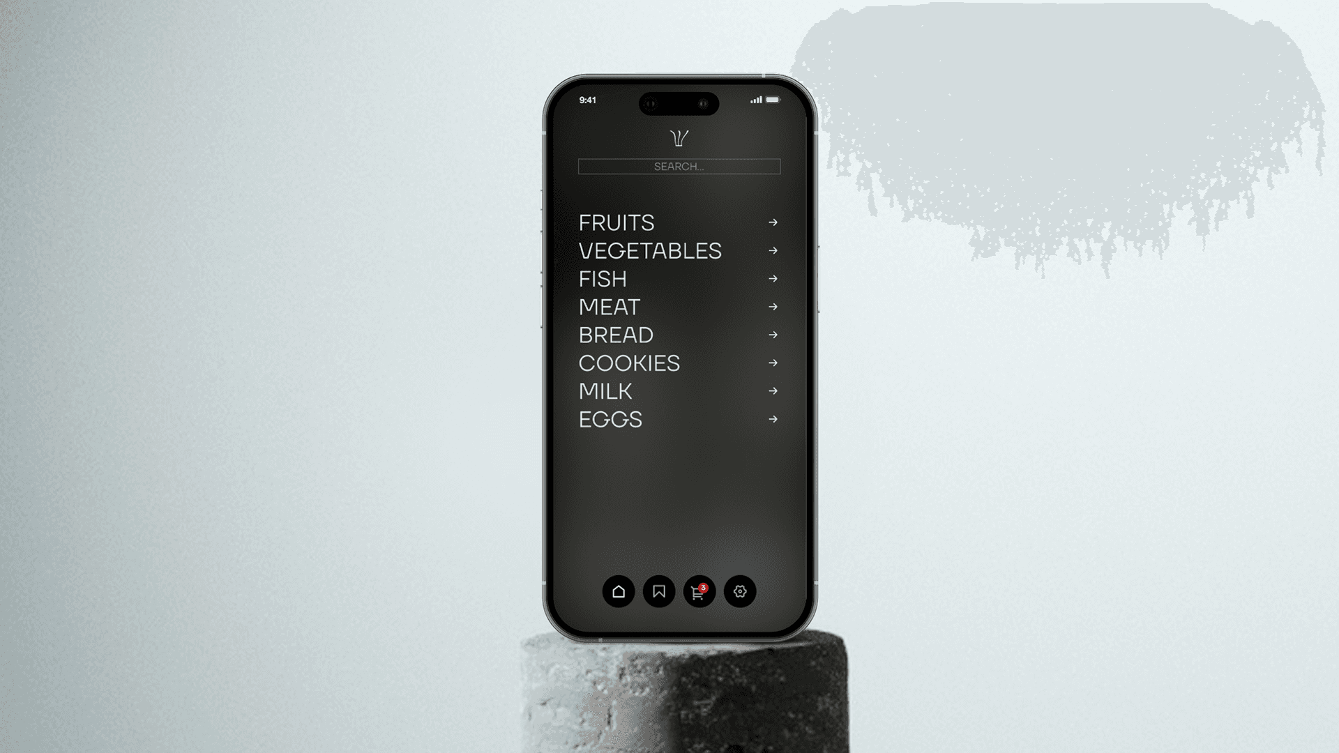
I designed an interface that not only simplifies grocery shopping but also empowers users to make informed, eco-conscious decisions. Key solutions included:
Eco filters: allowing users to filter products by sustainable packaging.
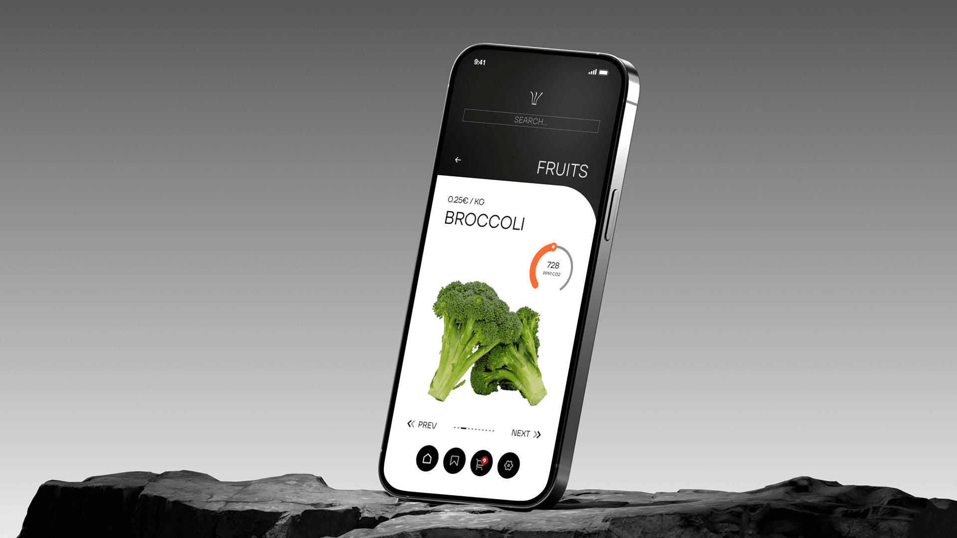
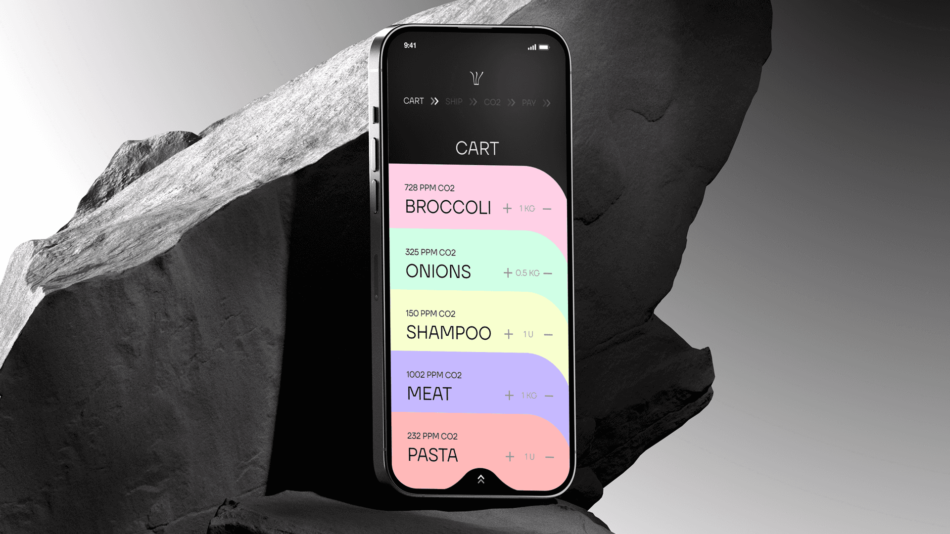
Clear product information: showing packaging details and environmental impact directly on product pages.
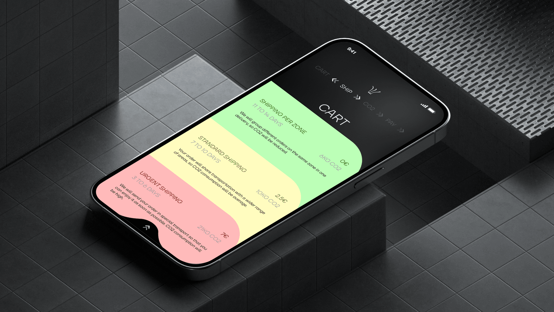
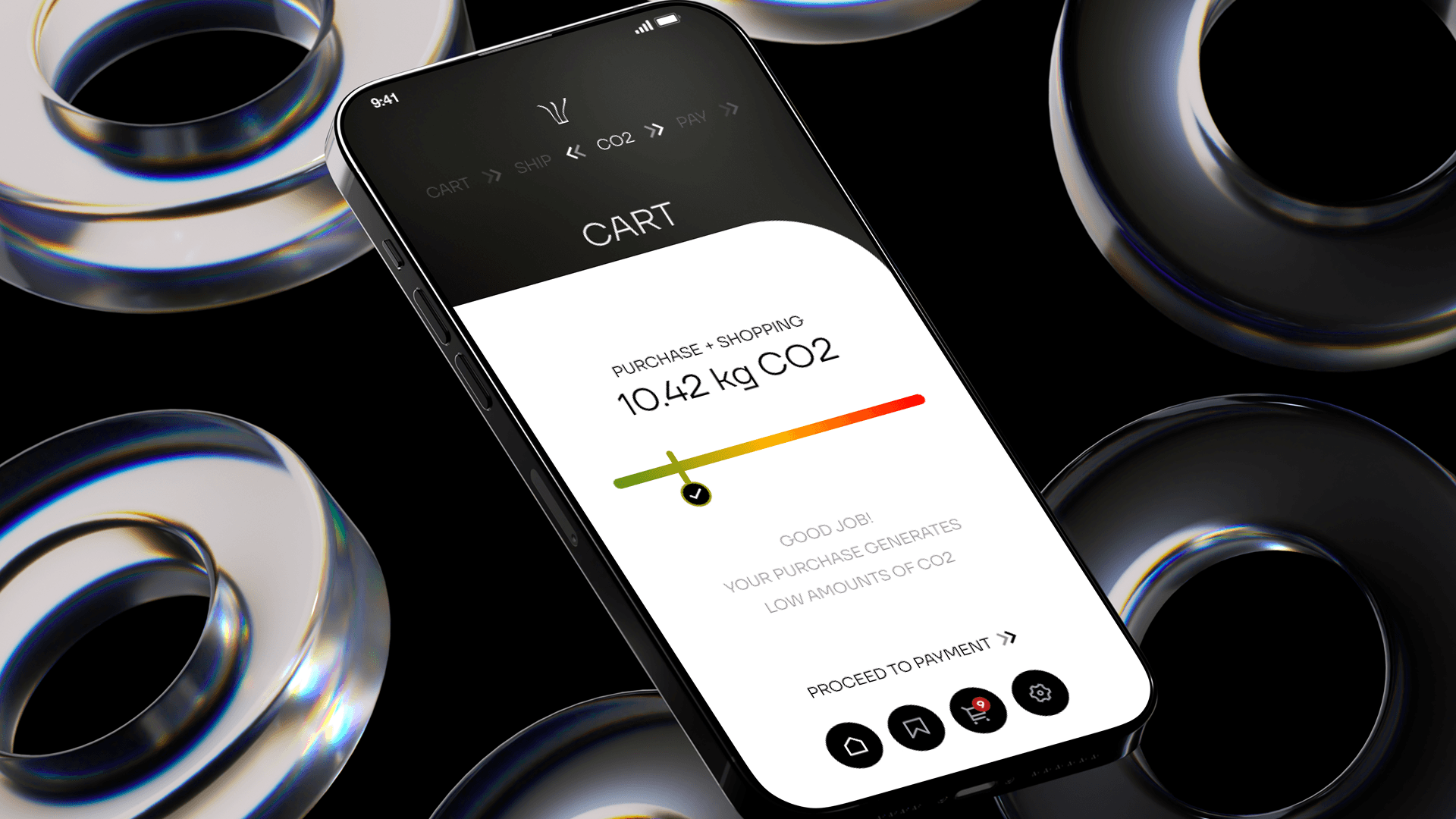
Smart suggestions: recommending lower-impact alternatives during checkout.
Step 3: Creating a cohesive and engaging visual identity
I developed a visual language that feels fresh, trustworthy, and aligned with environmental values. Our design choices included:
Friendly, legible typography: for a clear and approachable interface.
Illustrative iconography: reinforcing sustainability messages and improving usability.
Outcome
Ozone App delivers an online grocery experience that balances ease and responsibility. Users can shop as usual while accessing clear, actionable information about the environmental impact of their choices—encouraging more conscious habits without compromising convenience.
Smooth Scroll
This will hide itself!
This will hide itself!
Ozone
OVERVIEW
Ozone is a mobile app that helps people adopt more sustainable habits in their daily lives.
YEAR
2024
ROLE
Product Design
UX/UI
Visual Identity
Challenge
During research into the online grocery shopping experience, we uncovered a recurring issue: users expressed frustration over the excessive amount of plastic and unnecessary packaging included in their deliveries. This highlighted a clear disconnect between the convenience of digital shopping and the growing desire for more sustainable consumption.
The opportunity was clear: how might we improve the online shopping experience by integrating more responsible practices that align with users’ environmental expectations?
Approach
Step 1: Understanding the user and their pain points
I conducted interviews and surveys with frequent online grocery shoppers. The insights revealed two main frustrations:
Lack of transparency regarding the types of packaging used.
No real options to choose more sustainable alternatives during the purchase process.
Step 2: Embedding sustainability into the user journey
I designed an interface that not only simplifies grocery shopping but also empowers users to make informed, eco-conscious decisions. Key solutions included:
Eco filters: allowing users to filter products by sustainable packaging.
Clear product information: showing packaging details and environmental impact directly on product pages.
Smart suggestions: recommending lower-impact alternatives during checkout.
Step 3: Creating a cohesive and engaging visual identity
I developed a visual language that feels fresh, trustworthy, and aligned with environmental values. Our design choices included:
Friendly, legible typography: for a clear and approachable interface.
Illustrative iconography: reinforcing sustainability messages and improving usability.
Outcome
Ozone App delivers an online grocery experience that balances ease and responsibility. Users can shop as usual while accessing clear, actionable information about the environmental impact of their choices—encouraging more conscious habits without compromising convenience.
Smooth Scroll
This will hide itself!
This will hide itself!