Penny is more than just a skateboard—it’s a lifestyle. While the brand already resonates with a young, vibrant audience, there was an opportunity to strengthen its digital presence and support its community beyond the board.
YEAR
2024
ROLE
Product Design
UX/UI
Visual Identity
Challenge
The challenge was to design a digital product that captures the brand’s essence—fun, movement, and self-expression—while helping both beginners and experienced riders feel part of something bigger.
Approach
Step 1: Understanding the Audience
I studied Penny’s audience: teens and young adults who live actively, express themselves creatively, and love to challenge their limits. They’re not just into skateboarding—they’re into fashion, music, photography, and the sense of belonging that comes with a shared lifestyle.
Key needs we identified:
A space to connect with other riders nearby or around the world.
Tools to track progress, learn new tricks, and set personal goals.
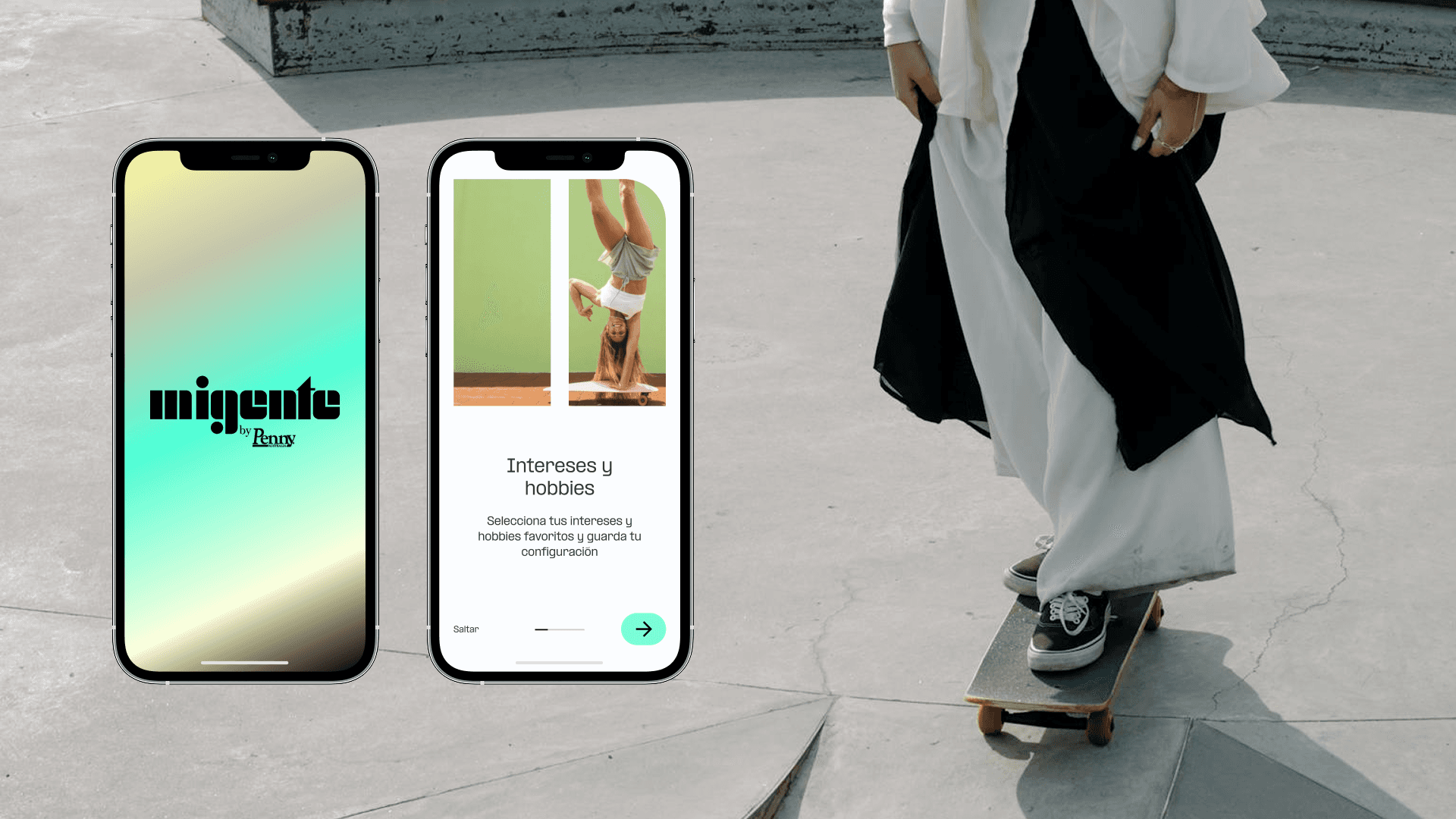
A platform that reflects their style, energy, and creativity.
Step 2: Design Strategy
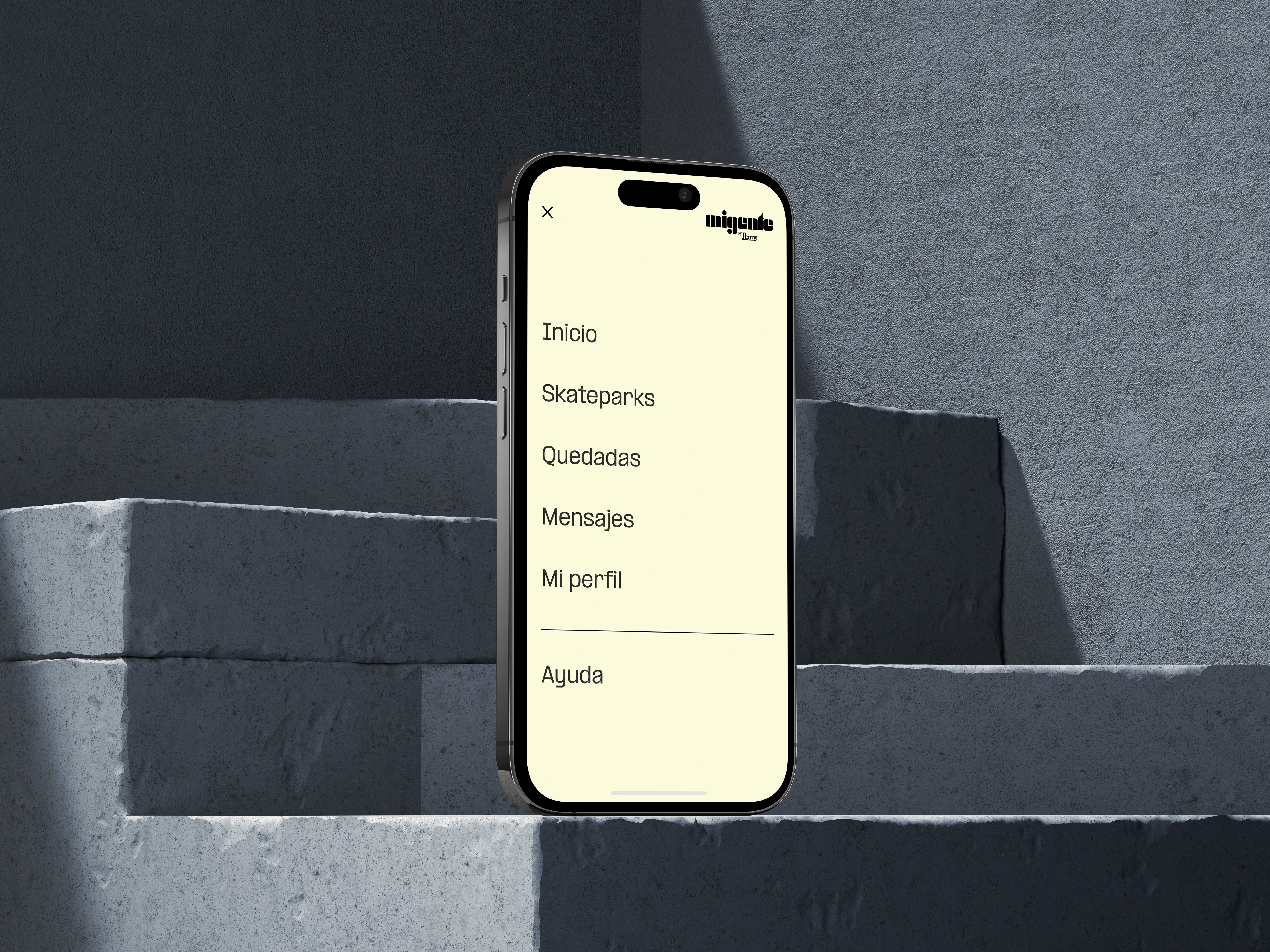
I focused the experience around 3 pillars:
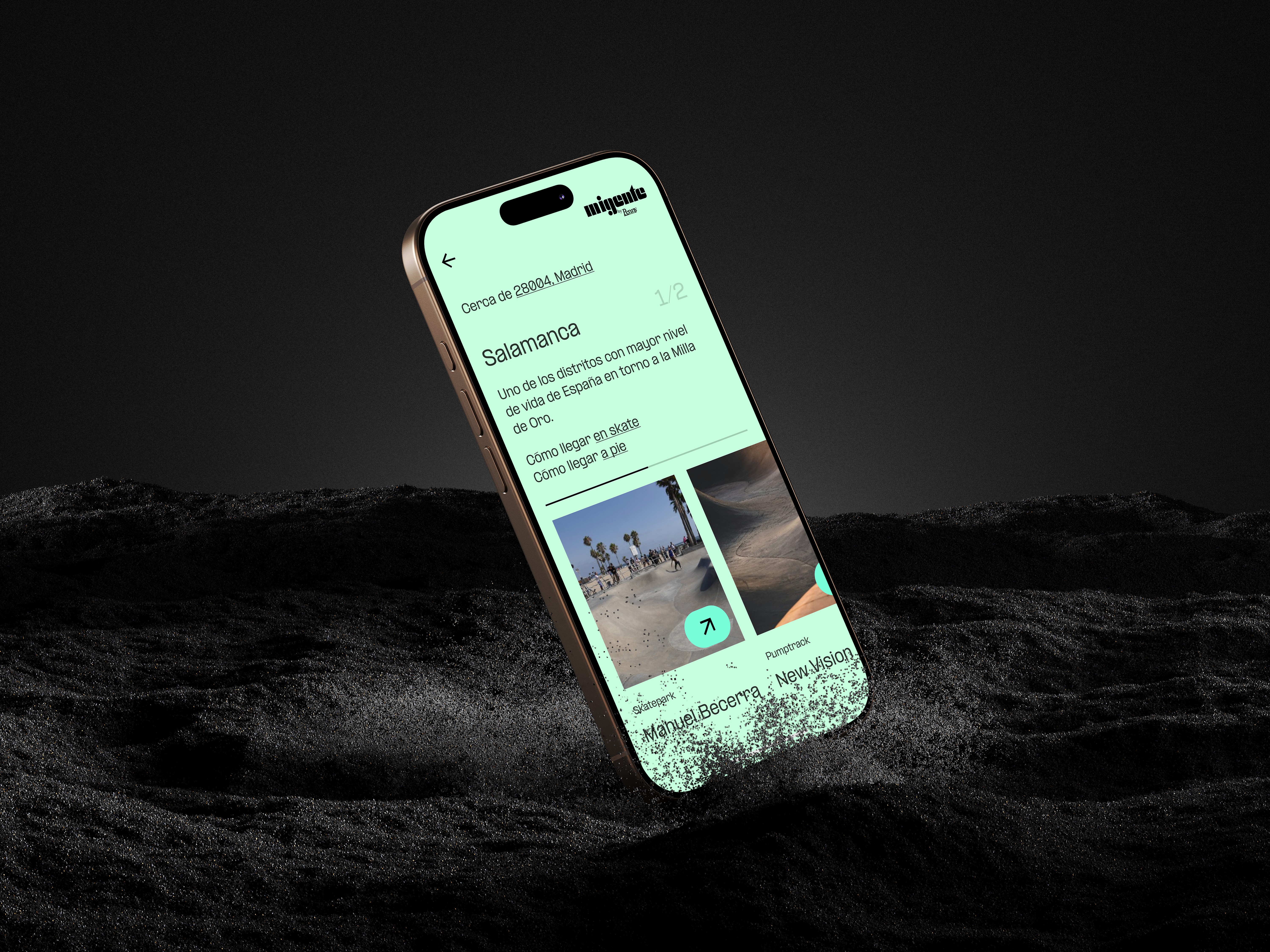
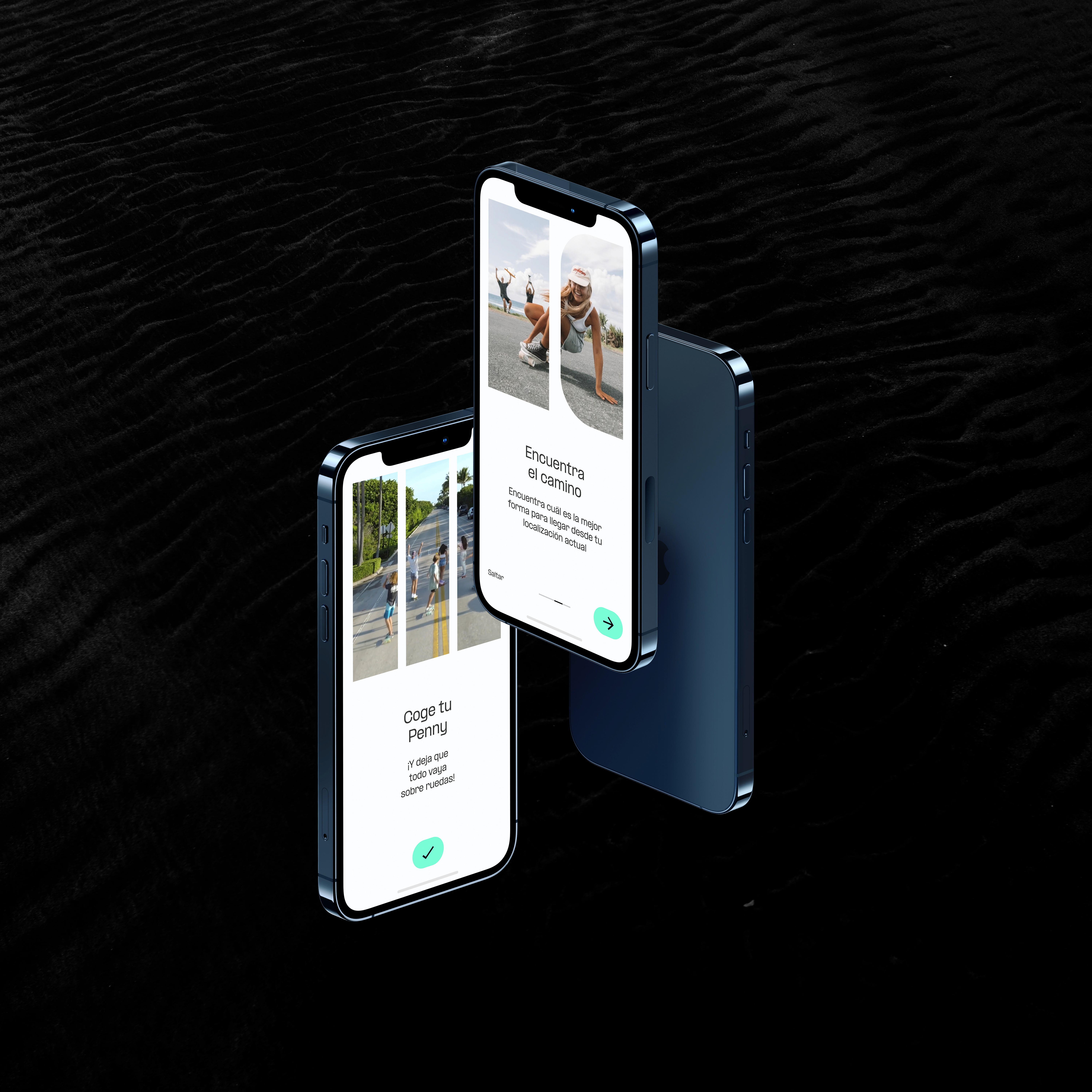
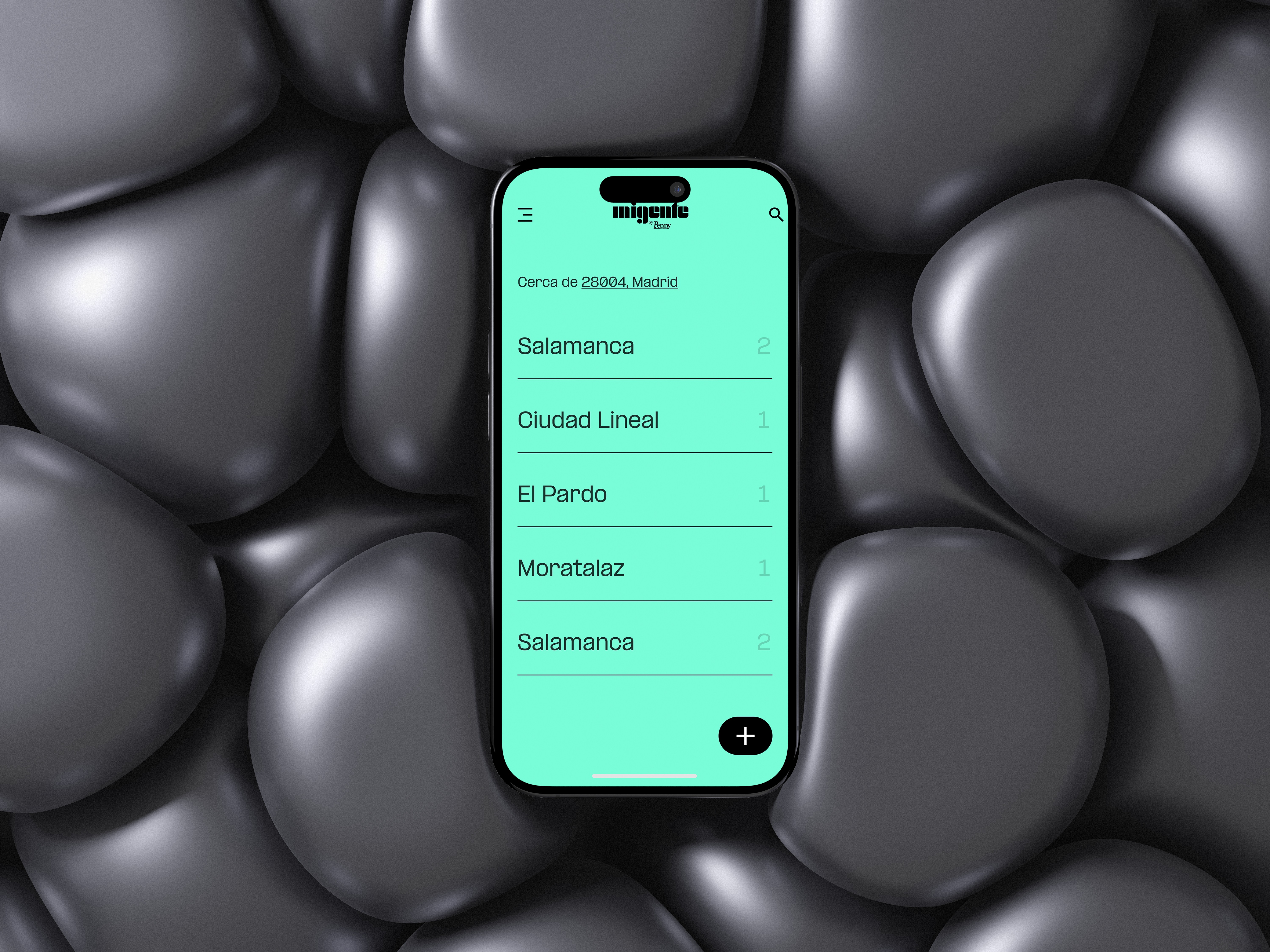
Explore – Discover skate spots, events, and riders in your area.
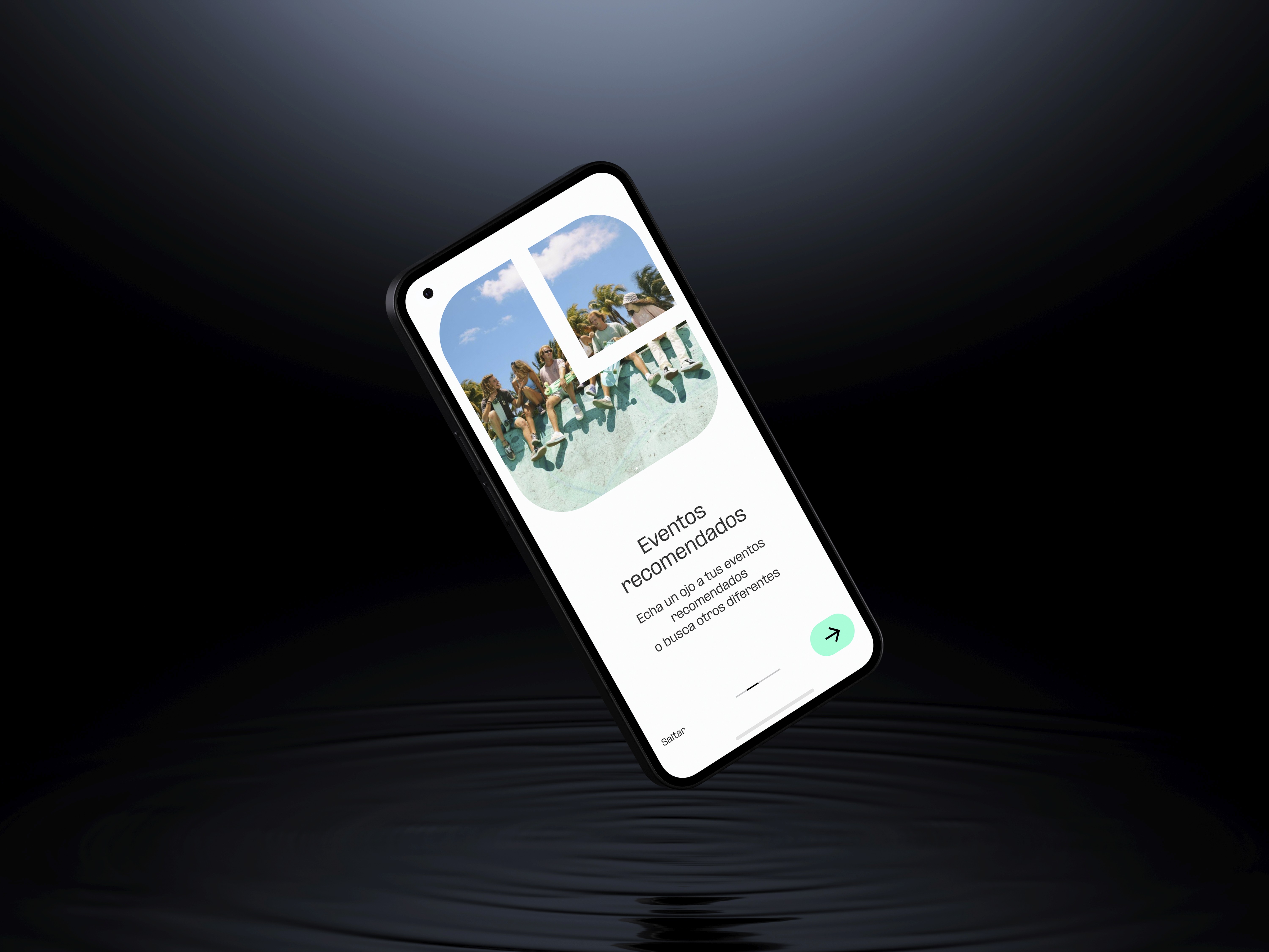
Progress – Track your rides, challenges, and skill development.
Express – Share clips, photos, and style with a like-minded community.
The visual design captures the playful and rebellious spirit of Penny: bold colors, dynamic layouts, and a mix of analog textures with modern UI components.
Step 3: Prototyping the Experience
Then, developed interactive prototypes to test:
Onboarding flows tailored to beginners and experienced riders.
Community maps and spot discovery features.
Profile and progress dashboards with personal flair and metrics.
Content feeds blending inspiration, fashion, and street culture.
Feedback from real users helped us refine the tone, usability, and visual direction to better resonate with Penny’s unique audience.
Outcome
Smooth Scroll
This will hide itself!
This will hide itself!
Mi Gente
OVERVIEW
Penny is more than just a skateboard—it’s a lifestyle. While the brand already resonates with a young, vibrant audience, there was an opportunity to strengthen its digital presence and support its community beyond the board.
YEAR
2024
ROLE
Product Design
UX/UI
Visual Identity
Challenge
The challenge was to design a digital product that captures the brand’s essence—fun, movement, and self-expression—while helping both beginners and experienced riders feel part of something bigger.
Approach
Step 1: Understanding the Audience
I studied Penny’s audience: teens and young adults who live actively, express themselves creatively, and love to challenge their limits. They’re not just into skateboarding—they’re into fashion, music, photography, and the sense of belonging that comes with a shared lifestyle.
Key needs we identified:
A space to connect with other riders nearby or around the world.
Tools to track progress, learn new tricks, and set personal goals.
A platform that reflects their style, energy, and creativity.
Step 2: Design Strategy
I focused the experience around 3 pillars:
Explore – Discover skate spots, events, and riders in your area.
Progress – Track your rides, challenges, and skill development.
Express – Share clips, photos, and style with a like-minded community.
The visual design captures the playful and rebellious spirit of Penny: bold colors, dynamic layouts, and a mix of analog textures with modern UI components.
Step 3: Prototyping the Experience
Then, developed interactive prototypes to test:
Onboarding flows tailored to beginners and experienced riders.
Community maps and spot discovery features.
Profile and progress dashboards with personal flair and metrics.
Content feeds blending inspiration, fashion, and street culture.
Feedback from real users helped us refine the tone, usability, and visual direction to better resonate with Penny’s unique audience.
Outcome
Smooth Scroll
This will hide itself!
This will hide itself!